
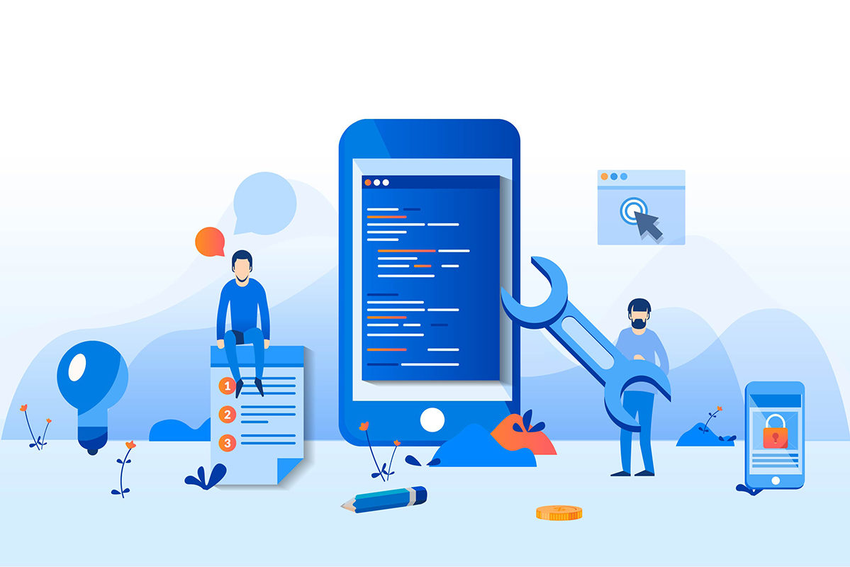
Given the number of people accessing the internet on mobile devices, a mobile-first approach to online courses is certainly worth the consideration of course creators.
Learners are more enthusiastic about accessing content on their mobile phones. Naturally, course design can either enhance or hinder their experience.
So what exactly is a mobile-first approach to online course design and development? If you plan to create an online course, what are the benefits of such an approach and how can you execute it? Let’s briefly discuss what a mobile-first approach to online course design and development involves.
What is a mobile-first online course?
Mobile-first online courses are designed to provide a great learning experience on mobile devices first and are then modified for other form factors. Thus, the mobile-first approach involves prioritizing mobile devices and ensuring that mobile users get an excellent user interface and user experience before designing for desktop users.
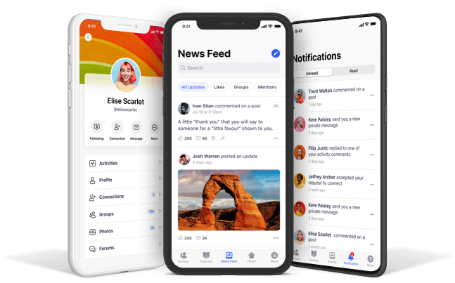
Mobile-first courses feature content that is designed to be easily consumed on mobile devices. Lessons are usually shorter, and are designed to accommodate interruption. They can also take advantage of notifications and reminders to keep students on track.
Benefits of a mobile-first approach
Aside from the fact that mobile internet use currently surpasses desktop internet use, there are a couple of other good reasons for designing for mobile devices first. For one thing, a mobile-first approach to design helps course creators include just the essential content and leave out unnecessary complexities.
Also, mobile-first courses promote micro-content which allows learners to retain a lot more information. It is also much easier to expand the design to cater for desktop users than to redesign a desktop online course to work smoothly on mobile devices.
So how can you apply the mobile-first approach to your course design and development?
How to create a mobile-first online course
When designing your online course for mobile devices, it is important that you implement accessible, simplistic navigation. Consider how users will be interacting with your content and make it easy for the learner to navigate through your course.
Designing with a portrait orientation in mind is key, as smartphones are more frequently used in this position.
You’ll also need to make sure that your course content can be easily digested on the go. Lessons should focus on one topic and feature short quizzes and flashcards. They should be easy to pause and resume, as mobile learners will regularly have to deal with interruptions, after which they may return later to learning.
Ensure that the teaching formats you use display nicely on mobile devices. Employ legible text and buttons that are easy to select by touch. Use video players that can expand to full screen. Design any charts or infographics to fit perfectly on mobile screens so users don’t have to scroll sideways to view content.
Of course, prioritizing mobile design does not mean that desktop design should be second-rate. A lot of learners may still prefer learning on their desktops or may use whatever device is most convenient at the moment. Still, a mobile-first approach to online course development is a great way to ensure that your course delivers a unique experience on both mobile and desktop devices.